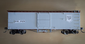
So.... I took a shot at designing custom lettering for my Sn3 boxcar with the intent of having custom decals printed. You'll notice the name corresponds with fake railroad from my last post.
Regarding custom water slide decals -- The real deal custom decals are expensive; like
almost $200 kind of expensive. The alternative is to have someone with an Alps printer run them for you. This is a far cheaper alternative at the limitation of only 600dpi resolution. According to Kadee that is enough resolution to be able to print a 6pt font.
Well, with that I took to doing some research on railroad logos of the 1920's along with period fonts and sketched out a few variations. It's much harder than it looks to create something plausible. I'm not 100% on any of the following. I might just find another railroad logo I like and change the name.
My wife picked #4 as the best, and I think I'm liking it more the more I look at it. The shape of the shield on the far right I stole clean off of Canadian Pacific's logo which is probably why it feels nicer looking (familiarity tends to make things more preferable). I was hoping to get the phrase "scenic lake route" in there somewhere however, but being limited to 6pt font makes it a bit harder to cram it all in without it being monster big.
 |
| #1 |
 |
| #2 |
 |
| #3 |
 |
| #4 |
 |
| #5 |
 |
| #6 |
 |
| #7 |


Your choice of fonts are too modern. Number 7 would look great with era-appropriate lettering.
ReplyDeleteMy other suggestion is to spend less time thinking and more time actually building.
Chris